15 Extreme Charts for April 2025
When the world is upside down, keep it simple.
Rarely do we witness volatility and uncertainty like now.
Here are 15 extreme charts for April 2025.
We’ve been loud and clear about the breath-taking datapoints recently.
We noted the weakest breadth dating back to October 2023. Then we suggested that the tariff trade war could send the Big Money Index oversold.
Folks, what we are witnessing today will be remembered for many years to come.
Investors are searching for clues on what’s next.
Today we’ll try and answer that burning question as we unleash a data-driven chart pack that should be in front of every single investor right now.
By the end of today’s post, you’ll have a better idea of what’s likely ahead.
More importantly, it’s possible that the unthinkable could occur. Hang around to the end and you’ll see what I mean.
Now, sit back as we unpack April’s unforgettable month.
15 Extreme Charts for April 2025
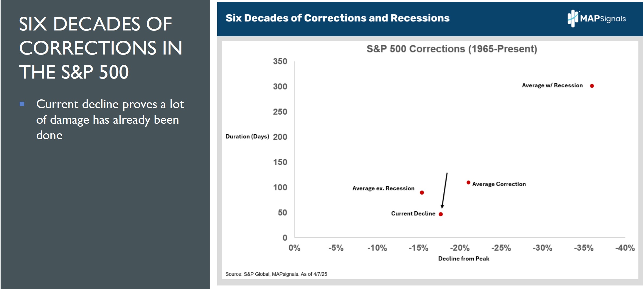
To kick us off, it’s important to note how much damage has occurred to equities.
Near the recent low, the S&P 500 was down nearly 19% from its peak.
Chart number 1 reveals how the current decline is reaching the average correction decline dating back to 1965:
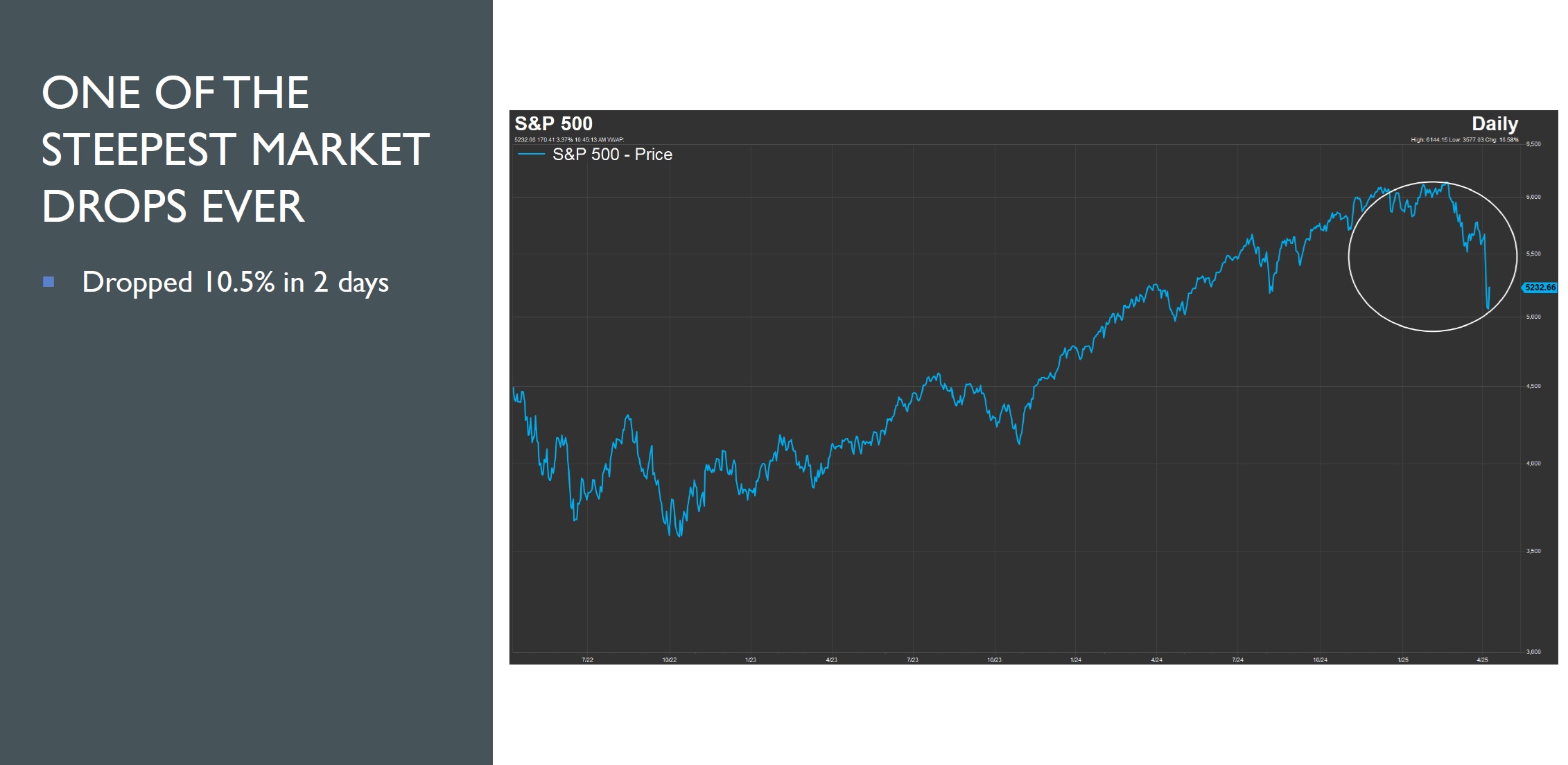
Much of this destruction occurred recently after an epic multi-day pullback.
Chart number 2 reveals how the S&P 500 had one of the steepest drops ever in a 2-day period, falling 10.5%:
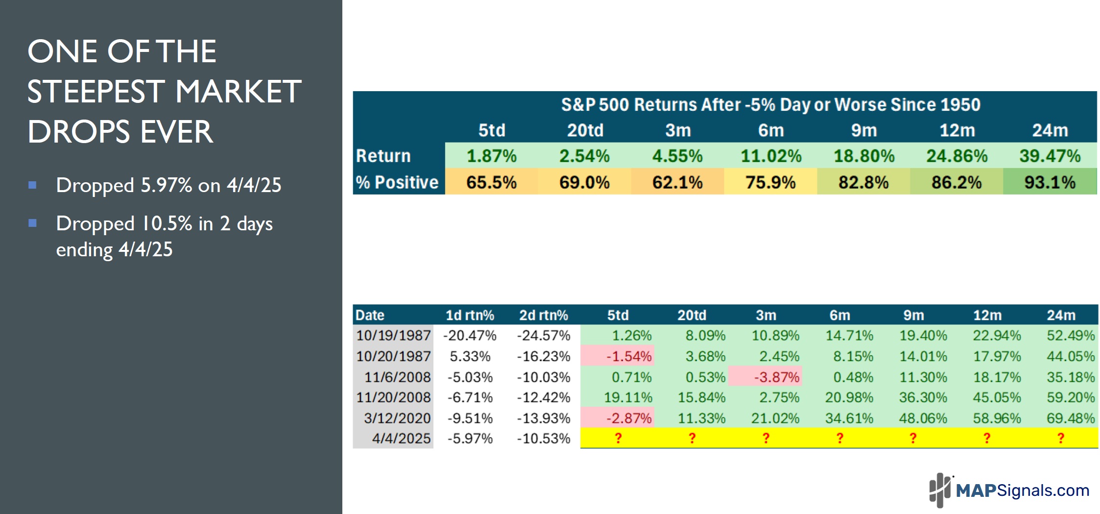
What comes next is anyone’s guess. But history tells us that brighter days are likely ahead.
Chart number 3 offers some needed perspective on what happens after the S&P 500 falls 5% or more in a day and when stocks fall 10% or more in a 2-day period.
On April 4, 2025 the S&P dropped 5.97%. 6-months later, on average, the market gained double digits.
Also, the 2-day decline of 10.5% was only beat by a few episodes in 1987, 2008, and 2020. 6, 9, 12, and 24-months later, markets gained massively in all instances.
Last week seems like a long time ago.
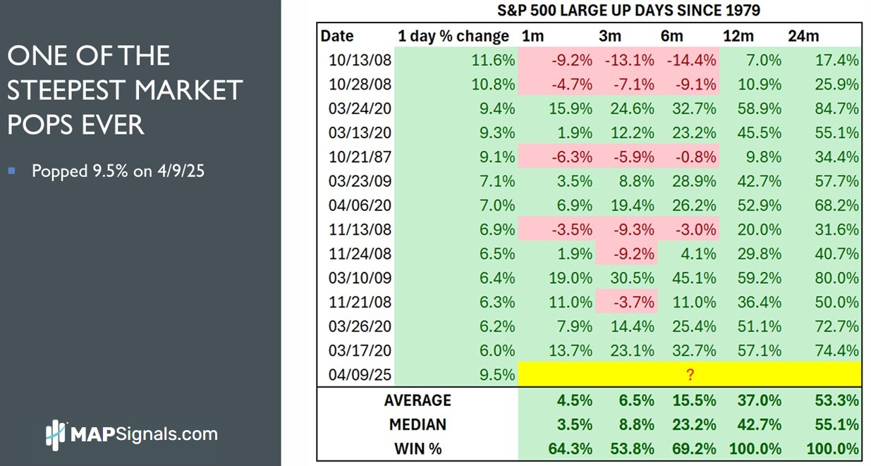
Chart number 4 shows how yesterday April 9th had one of the largest pops of all-time.
The S&P 500 surged 9.5%:
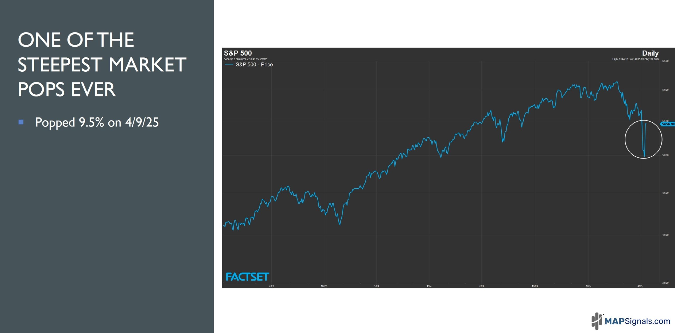
Is it a dead cat bounce?
Maybe.
Chart number 5 details each daily gain of 6%+ back to 1979.
I find it interesting that in all cases, stocks surged 1 and 2 years later.
Let’s keep going.
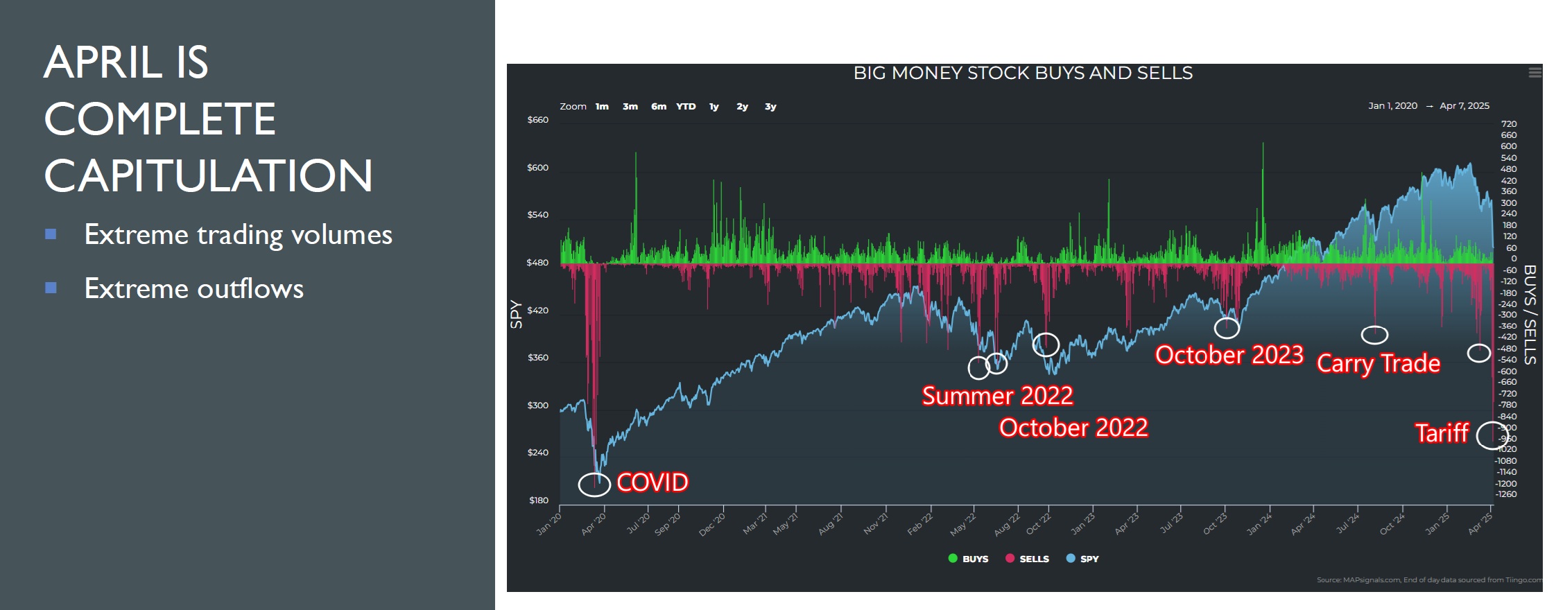
Under the surface, we’re witnessing some of the largest outflows ever.
Chart number 6 highlights how April’s carnage stacks up to prior recent similar events.
Nearly 1000 equities were liquidated. That’s on par with the COVID-19 collapse:
Fortunately, we can learn from these wicked de-risking events.
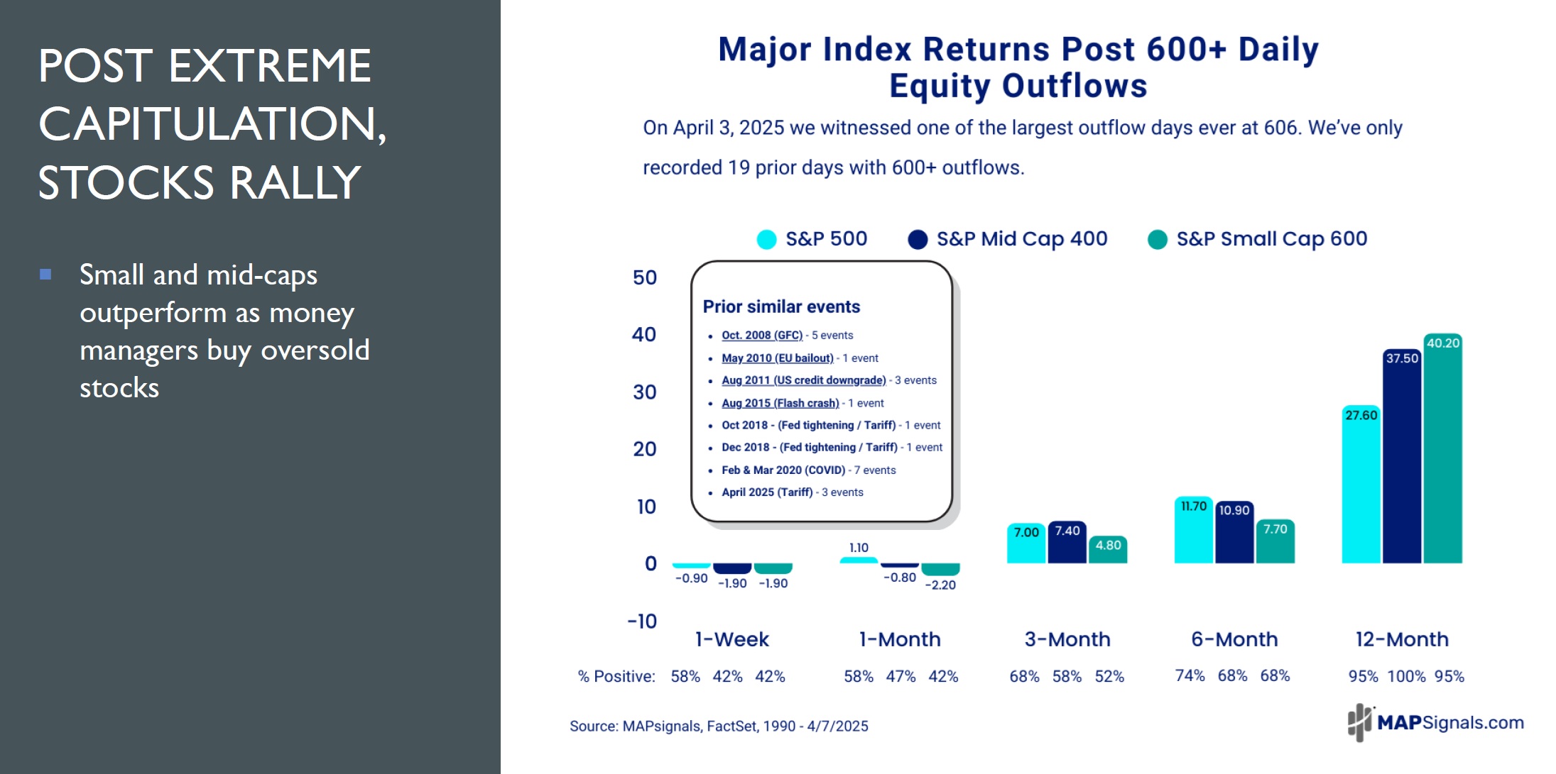
Chart number 7 reveals that equity outflows of greater than 600+ have only occurred during the most trying times.
What tends to follow 12-months later are market beating gains for small, mid, and large-cap indices.
We are at the halfway point. Go ahead and stand and stretch.
It’s going to get interesting the further we go.
There’s a hidden message inside of the 15 extreme charts for April 2025.
Again, you decide.
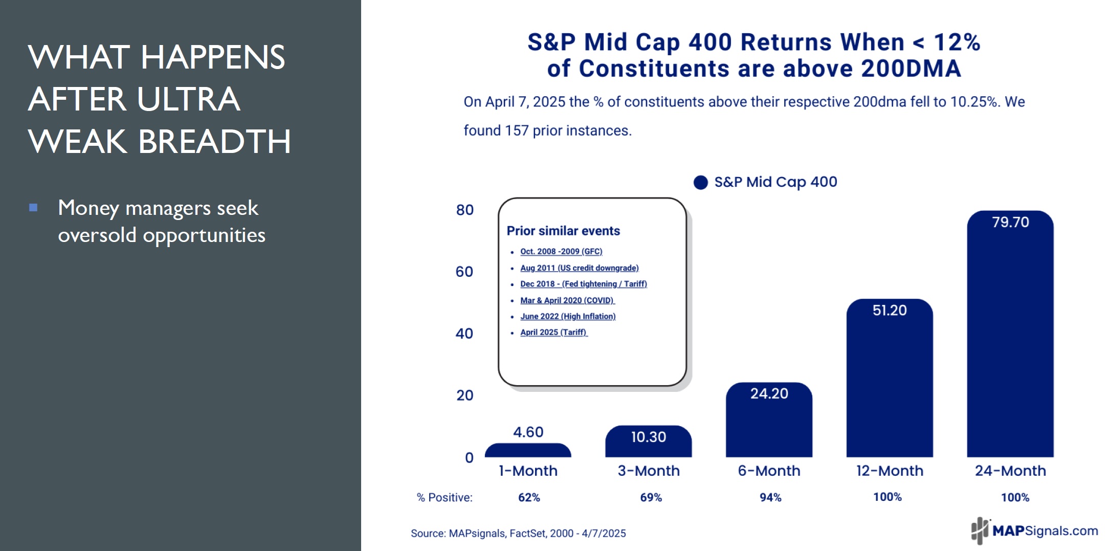
Chart number 8 shows how weak breadth is for the S&P Mid Cap 400. Just under 12% of constituents in the basket are above their 200dma.
That’s the weakest reading since June of 2022.
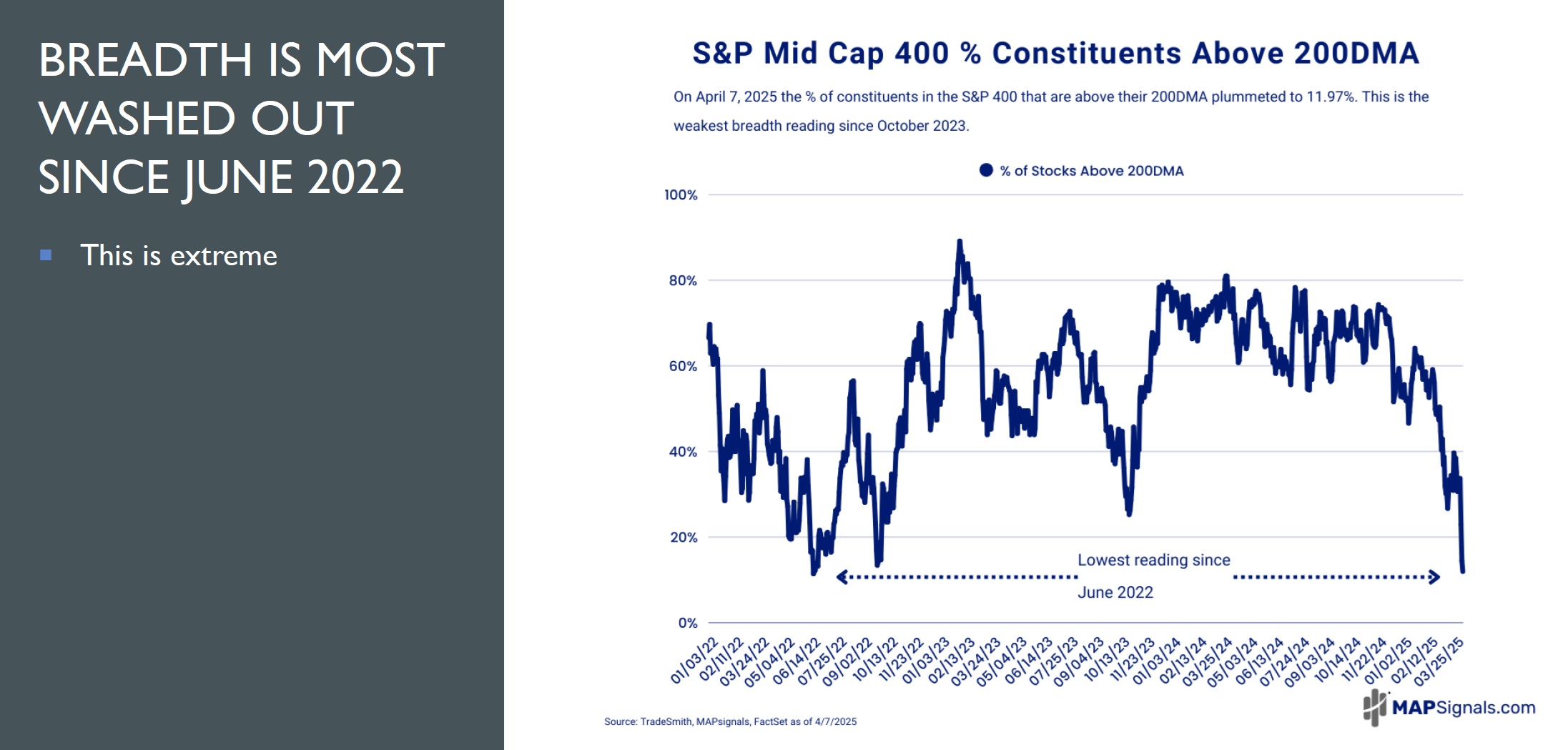
Virtually all major indices are washed out like this.
Chart number 9 can shed light on what is ahead as mid-caps were never lower 12 and 24-months later.
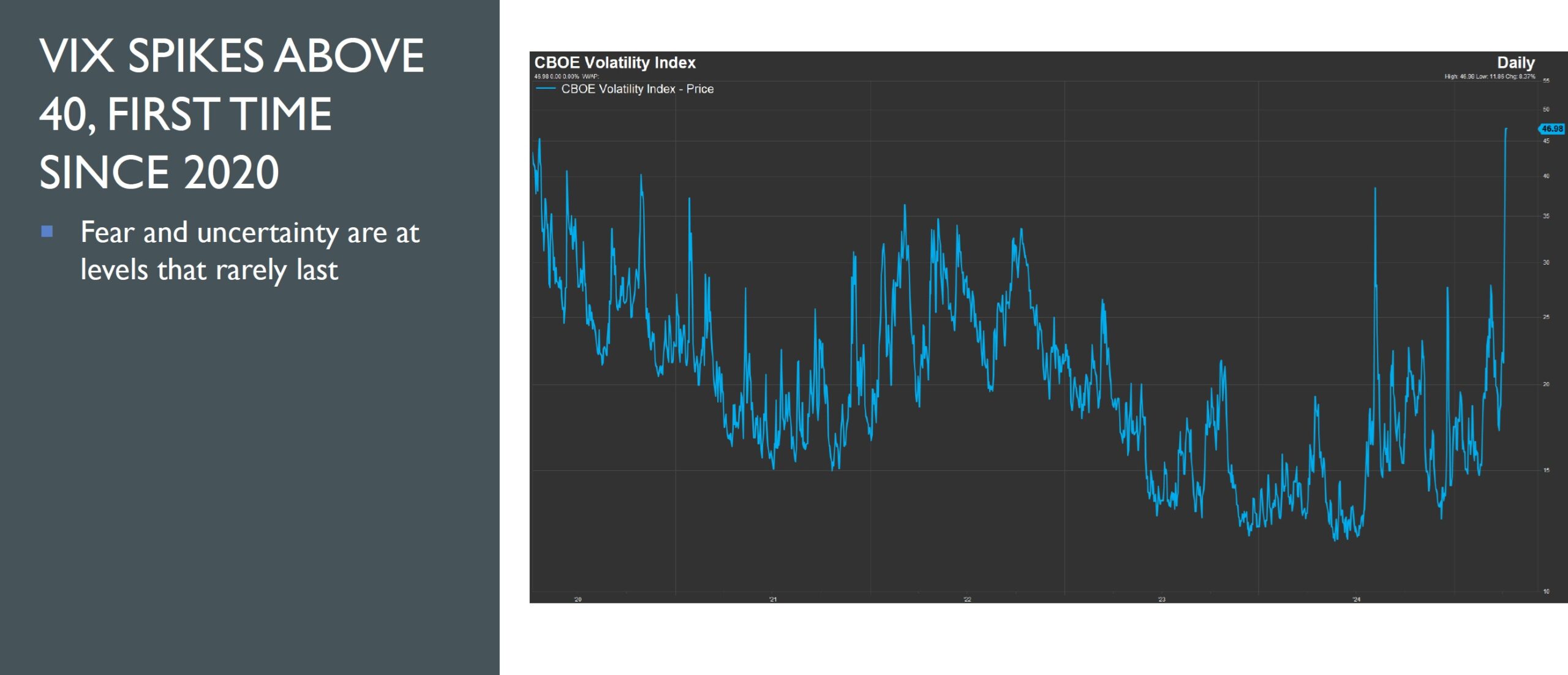
I cannot underplay how uncertain the world is today.
Volatility has ripped to levels last seen in 2020.
Chart number 10 reveals how the CBOE Volatility Index (VIX) closed above 40.
Let me be clear, I don’t have a crystal ball.
What comes next is anyone’s guess.
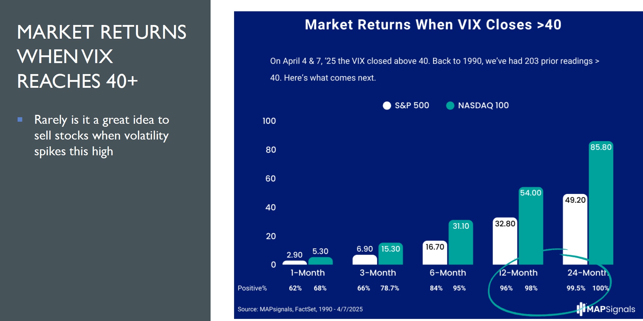
Chart number 11 puts a VIX close above 40 into much needed context.
I was able to find 203 prior readings of 40+ dating back to 1990.
12 and 24-months later both the S&P 500 and NASDAQ 100 returned market-beating gains with a very high hit ratio.
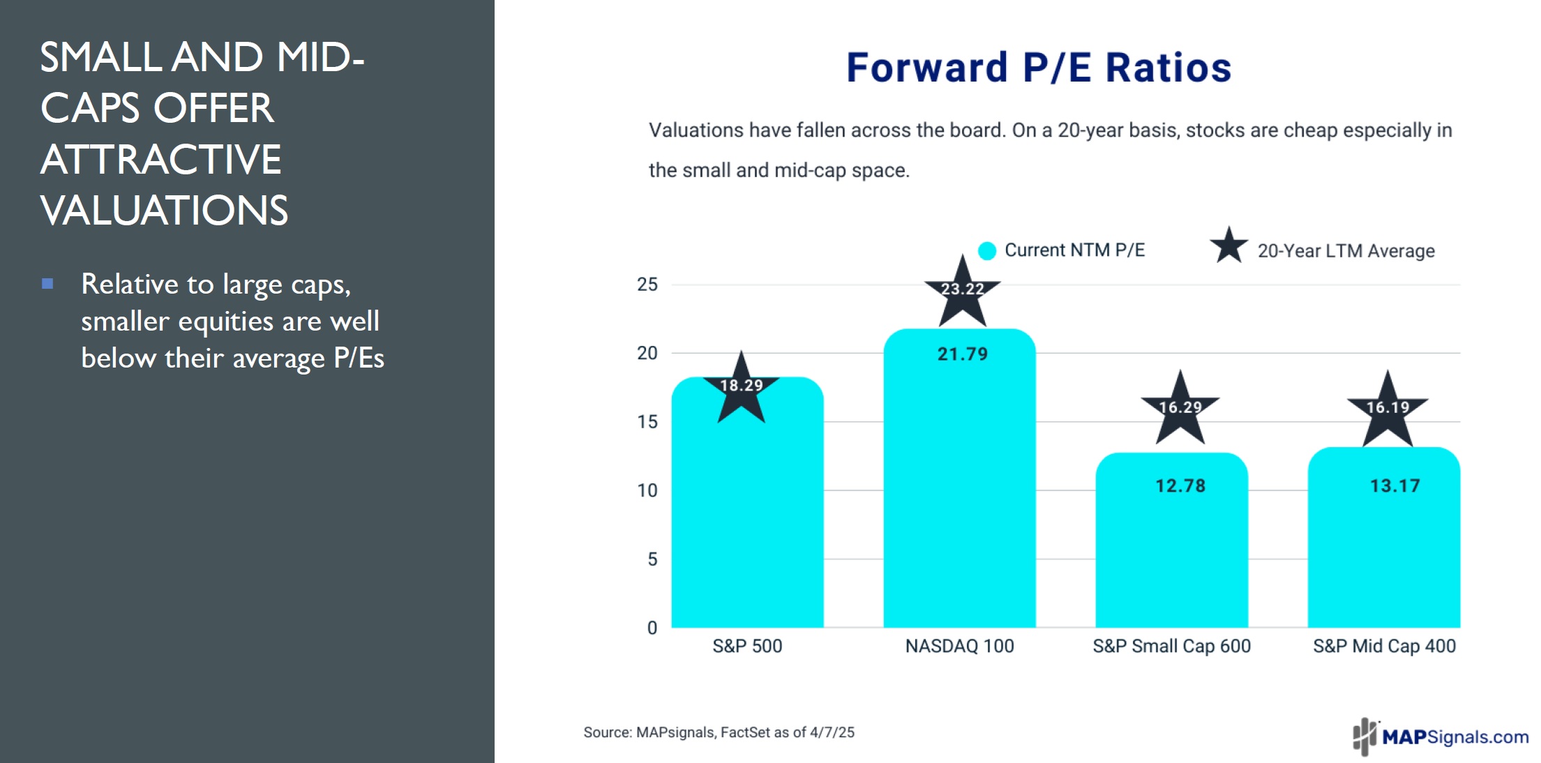
We can’t leave out valuations.
Chart number 12 from April 7th highlights how the forward P/E ratio of small, mid and large-caps are mostly below their 20-year LTM average.
Now for the million-dollar question. What is the gameplan for today?
The next graphic will help offer clues.
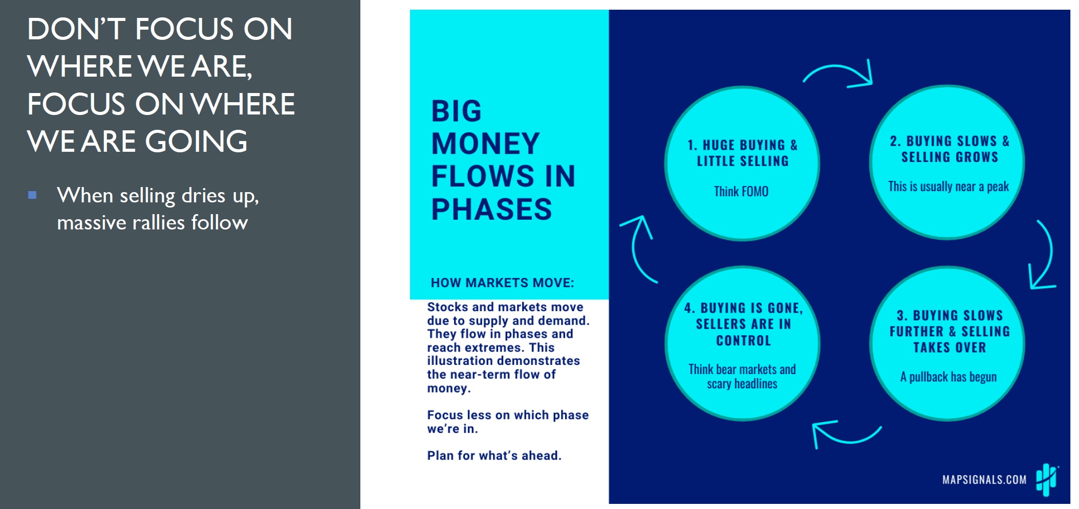
Money flows help us understand the most basic law of investing: supply and demand.
Chart number 13 reinforces how you need to focus on where we are going rather than where we are today.
We are clearly in phase 4 where buyers are non-existent and sellers are in control.
Here’s where the unthinkable is possible.
The declines we are witnessing today appear eerily similar to the most violent selloffs in recent memory.
Chart number 14 gives us a potential oversold playbook as the Big Money Index (BMI) broke into oversold territory near the max drawdown of March 2009 (back tested data) and March 2020.
Possibly one of our greatest calls ever came on March 19th, 2020 when we sent the marines.
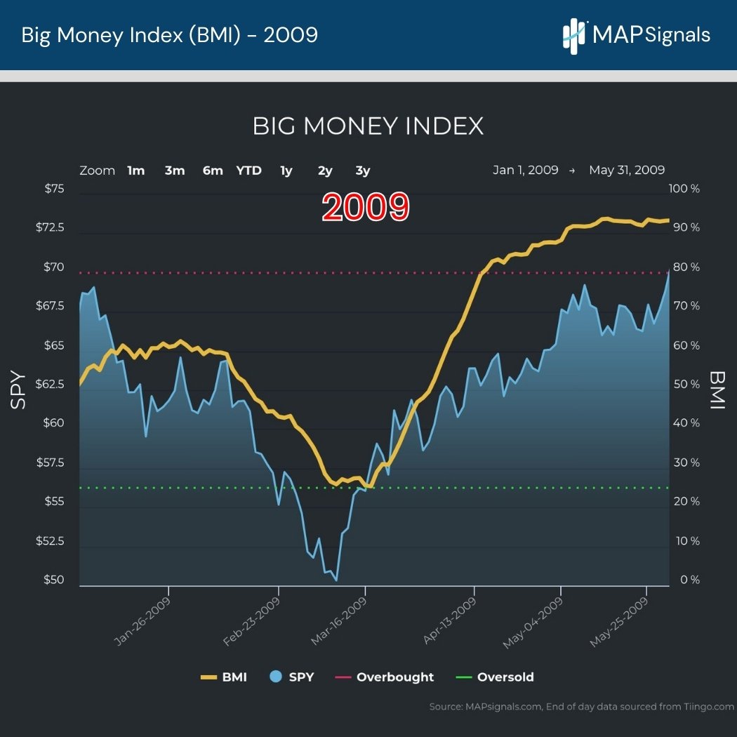
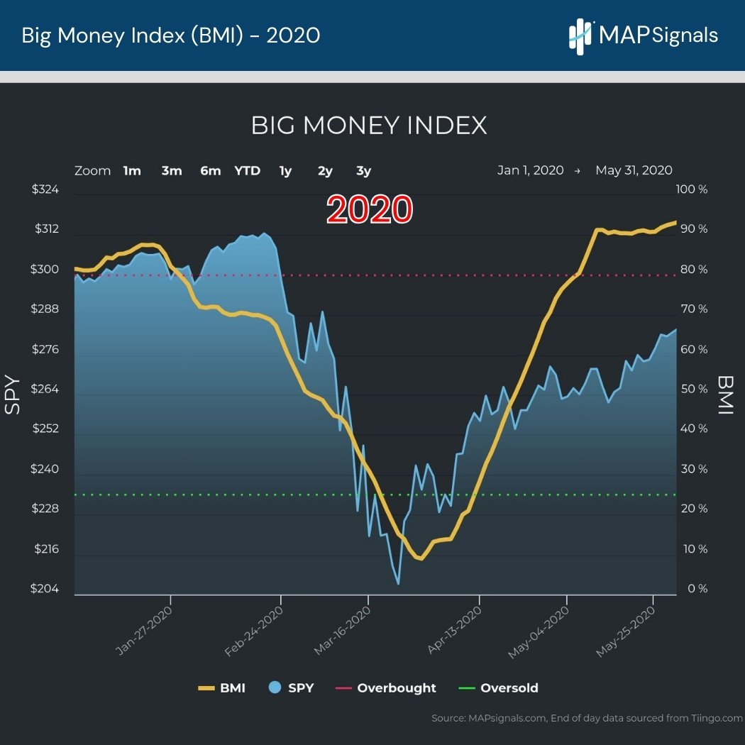
But notice what came soon after…an unthinkable overbought market!
Don’t shoot the messenger.
Chart number 15 reveals where the Big Money Index is today.
Will we go oversold? It seems likely.
Only time will tell.
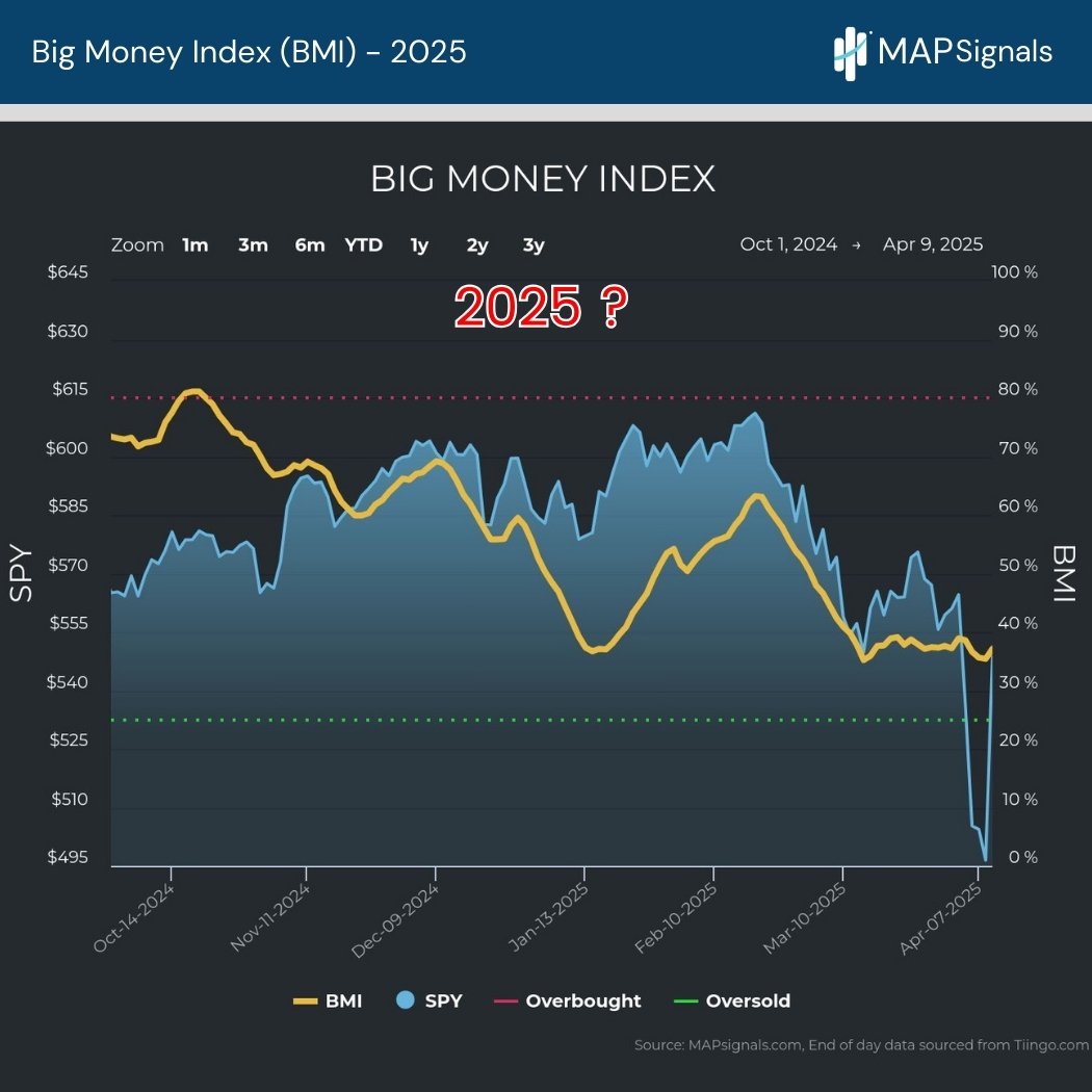
Is it possible that in just a handful of months we can be staring at an overbought market?
As a bonus, I’m going to include one more graphic.
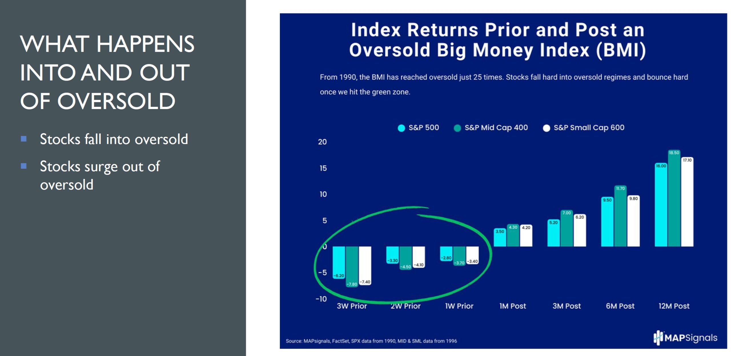
Bonus Chart (16) details what tends to happen leading into and out of an oversold Big Money Index.
It’s only occurred 25 times since 1990.
If history is any guide, stocks dip as we fall into the green zone.
And they rip months later.
Let’s Wrap Up.
Please understand that we are witnessing some of the most extreme events in equities.
Have we seen similar painful periods? Absolutely.
Did we eventually recover? Absolutely.
Will stocks ever go up again? I firmly believe so.
The Big Money Index (BMI) has been our secret weapon in the most trying market times.
Money will eventually find its way back into stocks.
I believe the BMI will lead the way again…like it has so many times in the past.
Don’t get lost in the headlines.
Follow the money flows.
Keep it simple.
If you’re a serious investor and are looking for a high-level evidenced-based approach to money flows – now is one of the best times to become a MAP Pro subscriber.
Just maybe the unthinkable will be here before you know it.
***Lastly, join co-founder Jason Bodner, May 15th–17th at the Hyatt Regency Miami, as he presents: Find Market-Beating Stocks and ETFs in 2025: 1-Click Quant Analysis at the 2025 MoneyShow Masters Symposium in Miami.
He’ll discuss our proprietary 1-Click Quant Analysis method of picking market-beating stocks and ETFs.
Click the image below to register now. You don’t want to miss this!