Sometimes situations require walking on eggshells.
Other times require dropping the hammer.
Today we’ll be dropping the hammer. But first, let’s talk about market head-fakes. The stormy clouds started parting on Friday and we sent an impromptu member update, stating that the buyers are back…video style.
The markets have done some incredible things lately. Signs pointed to an pullback that didn’t really happen. Our cash was ready to go to work, but it’ll have to wait a bit longer.
The data predicted a drop. Sellers showed up. Things looked to be right on schedule. But then there was an intervention. The powers that be didn’t want a market puke.
You see, when retail brokerages like Robinhood & Interactive Brokers decided to halt buying in certain meme stocks, it changed things. Wall Street was able to de-risk their awful short bets in orderly fashion. What set up to be a deeper pullback…didn’t work out that way.
MAPsignals data showed pain under the surface of the market. So, we prepared our readers. Like weather forecasters eyeing a storm, our job is the same for stocks.
But, markets flip-flopping is part of the game. That’s an automatic sign-up when you become an investor.
Stock market bobs and weaves can distract us from the real story: how great outlier stocks have been performing. The MAPsignals stock picks have demolished the market. Like the Super Bowl, it wasn’t even close.
But, before I start dropping the hammer, let’s check out where the Big Money Index sits.
Big Money Index Charges Higher
It’s been a bumpy few weeks in terms of Big Money data. But, now things are starting to settle back into a groove.
The pullback we foresaw did come, although it was very short-lived. Now the Big Money Index is heading higher:
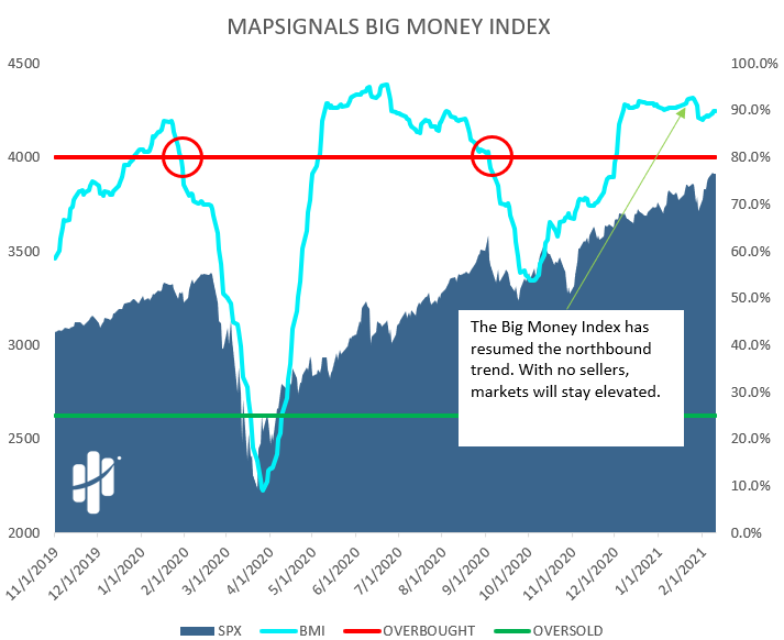
To simplify things, when the BMI rises, stocks should keep gaining. When it falls, stocks are usually soon to follow lower. The first signs of weakness appeared and sounded the warning alarms, but then quickly disappeared…for now.
We are still extremely overbought. Remember: a BMI reading over 80% is overbought. It now stands at 89.8%. Therefore, until there are signs of deterioration in our data, we must continue leaning long.
Now let’s look under the surface.
Stock Buying Is Back En Vogue
When the BMI is lifting, it means there must be chunky buyers around. And there are.
Below are the daily Big Money Stock Buys & Sells. If there are green bars, expect the BMI and stocks to rip. If there are red, expect a dip.
We saw the red. We prepared. But then brokers intervened which stabilized the market. Now, the juice is back. Look at all the recent green:
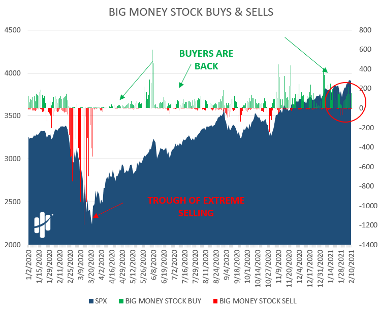
All of those green bars represent individual stocks blasting off like a rocket. And that’s where MAPsignals shines like no other place.
Outlier Stocks Dropping The Hammer
At MAPsignals, we have a mantra: TAGU – they all go up. Our MAPsignals members know we find explosive stocks. Basically, we’re mapping tomorrow’s winning stocks…today.
So, while market gyrations can cause ulcers, juicy outlier stocks provided the relief in the form of big gains.
Each week, we highlight 1 stock shaping up for big potential upside. This is part of our Sunday MAP View report. If you wonder how the MAP View stocks fared through the pandemic up until now, I’ll summarize it for you: the market was no match for MAP View outlier stocks.
Below we find the returns for all MAP View stock picks in 2020. We calculated performance as if you had purchased each stock on the date of the report and held until 2/9/2021.
We compare with the SPY ETF. The return was calculated the same way (purchasing weekly). Watch your feet, here comes the hammer.

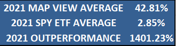
The MAP View stocks returned +37.87% on average vs. +24.35% for the SPY. And that’s for all of 2020 which includes the COVID-19 pandemic market shock.
But, what about 2021? Drum roll please… (we use hammers for our drums)

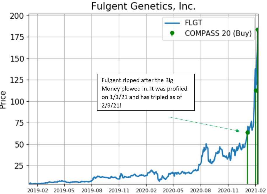
That’s right. The average gains for our 2021 MAP View stocks picks is +42.81%! Our first pick of the year FLGT- it tripled since January 3rd 2021. So, while the media focused on meme stocks like GME, AMC, and BB… Big Money was focused elsewhere – and MAPsignals knew where.

But let me hammer home another point: our Top 20 report has been rocking too.
Each week we list our Top 20 Big Money stocks. We also profile 2 of them. We do that for folks that want handpicked stocks so they don’t have to work too hard. Most people don’t have time to sift through twenty stocks a week. This helps with that.
Similar to the study above, here’s the performance for the 2 profiled stocks each week in 2020. We calculated the performance as if you had purchased each stock on the date of the report and held until 2/9/2021.
The SPY ETF return was calculated the same way (purchasing weekly).
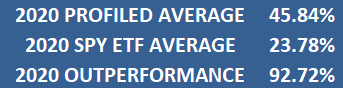
That’s right, they nearly doubled the performance of the S&P 500. Now, let’s look at 2021 through 2/2/21.
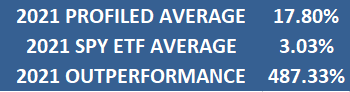
That’s mega juice, folks.
There are times to be subtle and times to be loud. We just dropped the hammer for a thunderous sound.
Here’s the bottom line: markets can and do change on a dime. Signs that pointed to lower prices suddenly point to higher prices. Eventually that will change, but that’s not the case today.
And as our subscribers know, we let our outliers run. When you catch a powerful bull market, like now – amazing things are possible.
Focusing on the market pivot points is important. But don’t miss the main message: outlier stocks hold the key to outperformance in both up and down markets. No walking on eggshells here: if you need outlier stocks, MAPsignals has what you want.
For more information on how to become a MAPsignals member, click here.

Lucas is co-founder of MAPsignals. His full bio can be found here.
Prior to MAP, he was Head of ETF Sales at Cantor Fitzgerald & SVP of Derivatives at Jefferies, LLC.
Thanks for your insights.
You follow the money institution but it seems that retail traders are having a real impact on the market going forward. This is new.
Would you consider looking at that aspect as well or you will keep focusing on the money institution solely which might not be as accurate as it was in the future?
Hey Mike –
We actually don’t have to do anything different because our algos follow wherever the Big Money comes from. Sometimes it’s hedge funds, other times it’s ETFs, and now it’s retail flows.
But we also take it a step further. We have a really cool ranking process that takes in to account the company’s fundamentals. So, rarely are we chasing unhealthy stocks. We only want high quality game changers.
Oh ok, I thought your BIG Money Index was based on institution money only.
So it sounds that it’s based on the broader inflow / outflow of money to the market without focusing on its source, correct?
It was built to find the institutional money. That’s over 70% of the flow historically and in some studies it’s over 90%.
But, our algos detect all big outsized trading. So, while it can be broad – most of the time our signals are seeing institutions.
This is the way.
Everything has a lifespan, outliers too. They get replaced with other outliers. How do you know the end of a outlier ?
That’s the holy grail question right there.
Eventually Tom Brady won’t win Super Bowls. I think outliers have the most bang for their buck early on in their life cycle. Then as they get massive they become more like a utility and spin off dividends.
You never know which ones will make it all the way. We like to bet across a spectrum of names. The more they keep seeing the Big Money the better. Great companies tend to stay great when they have top notch management.
Some companies are the leaders. We focus there.
When a great company fails to create new products and fails to adapt to newer technology/trends they could fall from outlier status. How do we fight that? Keep investing in new names 🙂
I understand that your outliers are doing great; but I am sorry that I cannot find the historical performance of new and old outliers so I can make my own judgment. Please point me to the right place or publish the data so I can benefit from your recommendations. Specifically, I would like to see an outlier performance chart that includes, but not limited to, Stock Symbols, Company Names, Industry, buy day, buy price, current return, current price, buy below price, etc. Thanks. Long-time subscriber.
Hey John –
Thanks for the support. We will have that capability once the visualizations are built. For now, you have to look at the member pages and see the weekly picks.
The same goes for options – and they have been rather juicy too!
Great work! I am a small private investor (trying to rescue my disastrous pension fund), but have recently upgraded to MAP Platinum and do not regret it. However, I tried to ask a question through the contact form and never got a reply. As a subscriber, how should I ask questions?
Essentially what “sri” has asked above is what I would like to know regarding the MAP Top 20 list: Say a stock appears in the top 20 as a newcomer and I buy it. But a week later it has disappeared from the top 20 and its performance for the week has been lackluster. Time to sell it? Should many of the MAP Top 20 stocks be seen as short term trades (days)? How to make the best use of the MAP Top 20 in your experience?
First off – we respond to ever message that comes in. Maybe it isn’t reaching us or our response is being blocked? Regardless, you can always email info@mapsignals.com and get a response.
The best way to use the MAP 20 is to look at names that we profile and the list of “prior outliers.” That makes it really easy. The handful of names that keep reappearing in the Top 20 will be the future MAP 50 names.
We will be doing more member update videos to go over the names we are zeroing in on. Our last update got a lot of positive praise.
Thanks a lot for answering my questions! I am looking forward to more videos and news about the Big Money Indicator. I have tried many investment advice services over the years, but this is the first one that actually works for me and gives me the confidence that I won’t be just watching all the gains disappear in the next dip.
On the topic of Map20 performance in 2020, what would the returns have been for an equal weighted weekly rotation into the Map20 stocks?
I’m happy to have a guide as Mapsignals! The Market currently is nervous, this past week the Vix ran high, however
the stocks didn’t reciprocate to the fear.
The market is seriously overbought, can you give us a more specific time frame when the buyers will wake up and stop overpaying and the sellers will line up for days?
It’s crunch time!
Patient In Palm Beach
Hey Patrick –
It’ll come when the sellers show up. And we’ll know it once the BMI starts to descend.
My cash on the sidelines is getting cold…icy cold.
Hi Maps!
Thank you for all of your great content. As always, it’s been incredible to have Mapsignals delivering such great data alongside charting these incredible signals.
Your team is always great at sending great content throughout the week, especially when things get a little turbulent. I always enjoy the narrative to help plan out my trading week. I was wondering if there might be a feature in the near future where members might be able to get more frequent BMI data, perhaps mid-week..or a visualization page where we can see where the BMI sits on a Wednesday for instance.
The reports are wonderful in pointing out where things stand from week to week. When things get overbought, the weakening of the indexes or these sudden VIX spikes obviously leave a little uncertainty on how quickly selling might escalate. I was just wondering if there might be a possibility in the future to get a sort of “ad hoc” BMI reading once prices continue to float along in overbought or oversold territory.
Hey Albert –
We are in the midst of building out that functionality to have for our subscribers. It will be ready later this year. Hopefully within a couple of months.
You guys are amazing!
Cheers!