
Macro: 7 Charts Signal More Pain for the Bears
This market just won’t quit. The S&P 500 is up 25% since late October!
It’s tempting to think this epic rally can’t last. The urge to cash out is hard for many to resist.
Our macro message for investors (not traders) is stay the course – 7 charts signal more pain for the bears.
Remember that bull markets are born on despair, mature on skepticism, bloom on acceptance and finally die on euphoria. This time-tested behavioral evolution takes years to play out.
Since 1930, bull markets have averaged 694 trading days. This one is only 349 days old. It’s middle-aged.
According to Bloomberg, the average S&P 500 YE 2024 strategist forecast is only 4915. No euphoria here!
Today we’ll show you seven macro charts that signal further highs for stocks this year. Then we’ll show you three sectors with the most upside as this broadening bull market keeps on chugging.
7 Charts Signal More Pain for the Bears
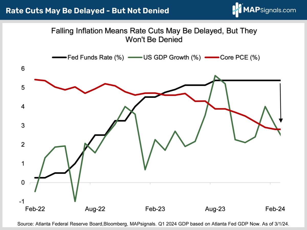
The biggest macro driver supporting stocks is the Fed put…it remains alive and well. With inflation continuing to fall, investors are confident the Fed will begin cutting rates by the summer (chart).
With the economy growing steadily, delayed Fed easing hasn’t been enough to end the rally.
As long as the economy is expanding and cuts come, it doesn’t matter whether they start in March or July.
History shows stocks do well after rate cuts start with the biggest gains coming when we dodge a recession.
Since 1964, the S&P 500 has risen after the start of 7 out of 11 Fed easing cycles. The average gain is a solid 8.4% in the 12 months after the first rate cut.
In the 4 instances when the S&P declined after the Fed started easing, the economy was in recession. Note the losses were manageable, averaging only 10%.
The chart below details how Fed rate cuts will eventually dovetail with cooling inflation:
OK the Fed and rates will continue to support stocks. Here’s our next bear crushing chart.
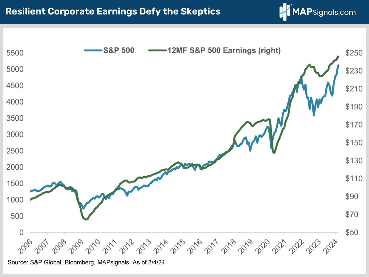
Stocks don’t follow headlines. They follow earnings.
Despite all the bearish handwringing, Q4 earnings came in much better than expected with net margins clocking in at a healthy 11.8% (that’s what’s left for shareholders after expenses and taxes).
12-month forward S&P 500 EPS continue to be revised higher. They just hit an all-time high of $246 (chart).
Notice how equities and earnings move in lockstep over time:
OK but how do we know earnings will keep climbing?
Great question. Check out these next 3 bear bruising charts.
Companies’ biggest cost is labor. Annual unit labor costs have fallen sharply from 14% at their 2020 pandemic peak to less than 1% today (chart).
If one of your largest cost inputs is falling, that’s eventually going to benefit shareholders.
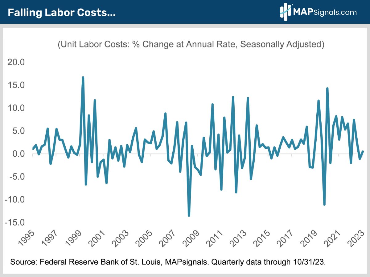
That’s great news for companies’ bottom lines. But let’s keep the bear beating going…
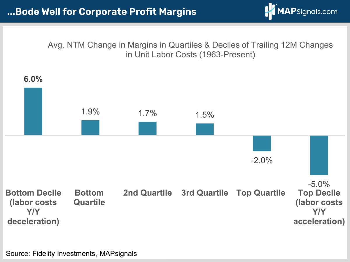
Since 1963, when labor costs dropped sharply, corporate profit margins have expanded by an average of 6% over the ensuing year.
Again, earnings growth drives share prices:
If you think I’m done, keep thinking. The macro earnings story gets even better.
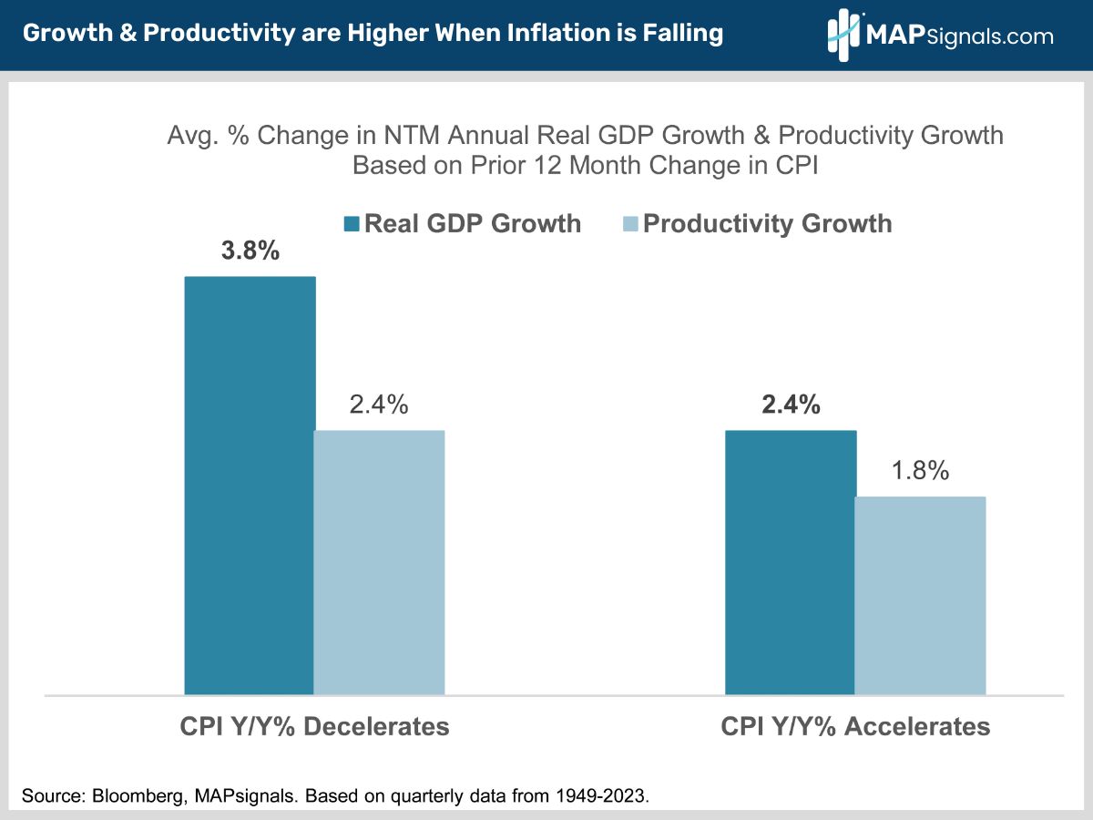
When inflation is falling the economy averages faster economic and productivity growth than when inflation is rising (chart).
That’s exactly what’s happening now.
Let’s face it, the macro backdrop for higher earnings doesn’t get much better than this!
What This Means for Your Portfolio
We rode the technology train hard last year. In June, we told you technology would keep outperforming on the back of a superior earnings outlook.
That’s exactly what happened. Mega cap tech’s profits are soaring.
Tech’s 12-month forward earnings growth has been revised up to 17.3%. That towers over every other sector and the S&P’s 11.2% growth (chart).
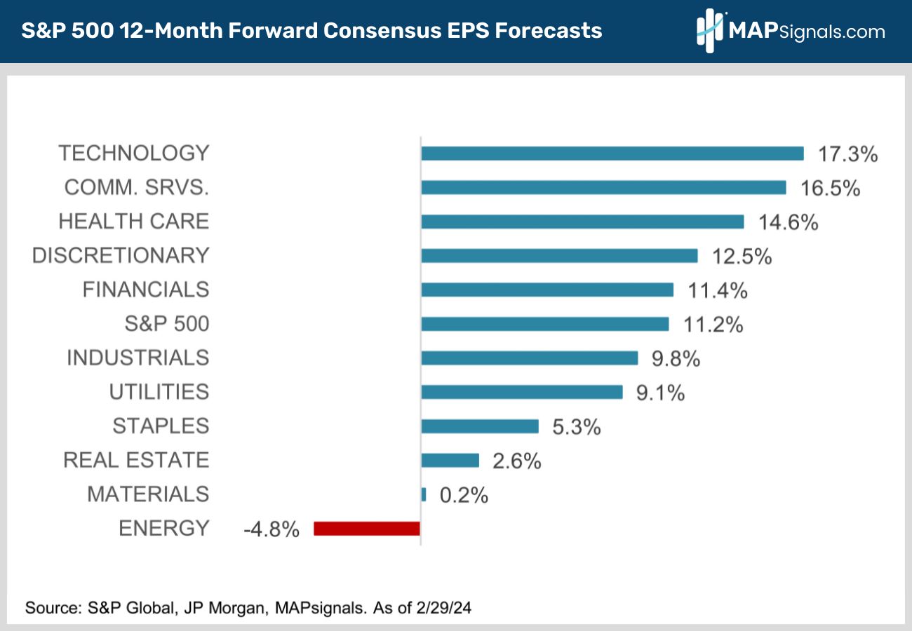
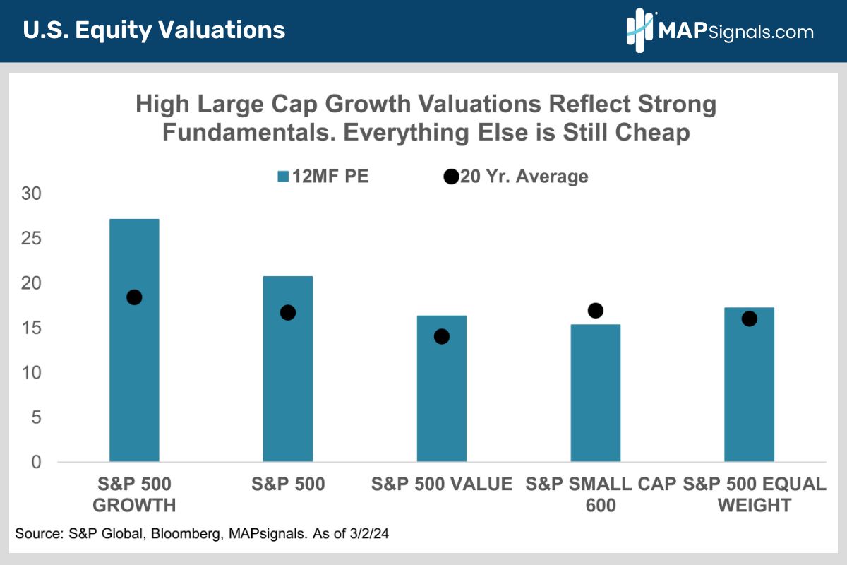
The bottom line is big tech’s premium valuation (chart below) is easily justified by its much faster earnings growth.
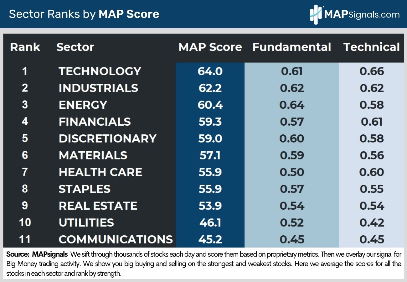
Tech is still our top ranked sector. It’s the first sector we’d buy on weakness.
What other areas do we like? Let me circle back to our January note where we told you the rally would finally broaden out and to overweight two of 2023’s biggest laggards – health care and financials.
It’s early days but so far so good, financials and health care are the top YTD sector performers outside of tech and communications services, up 8% and 7%, respectively.
Healthcare is forecasted to post 14.6% 12-month forward earnings growth. It trades at a 12MF PE of only 19X giving it a P/E to growth ratio of about 1.2 – the lowest of the S&P’s 11 sectors.
Regulatory worries really held health care back in 2023. The website Predict It now forecasts Trump edging out Biden by 6% in the Presidential election. Even though a Trump presidency is far from certain, the prospect of a GOP win is bullish for medical stocks.
As for financials, blue chip banks are holding up well despite regional bank stress. The sector is seen posting a healthy 11.4% estimated 12MF EPS growth.
As the Fed cuts rates, short-term bond yields will fall, steepening the yield curve.
Banks borrow short and lend long so a steeper yield curve makes their loans more profitable. It boosts banks’ net interest margins.
And the sector is home to a lot more than banks. Leading global financial data vendors like S&P Global (SPGI), FactSet (FDS) and MSCI, credit card companies like Amex (AXP) and Visa (V) and investment banks like Goldman Sachs (GS) and Morgan Stanley (MS) are all doing fine.
The sector is also the 3rd cheapest in the market with a 15.4X 12MF PE.
As for the rest of the market, many interest rate sensitive sectors like real estate, utilities and staples are all lagging. They’re all in the bottom half of our sector rankings.
They will all do better once the Fed begins rate cuts. Until then, expect them to keep underperforming.
Bringing It All Together
Stocks have had an amazing run. Resist the natural urge to sell. Stocks will be even higher later this year.
The Fed put is alive and well. Inflation is falling.
While rate cuts may be delayed, they won’t be denied.
Since 1964, the S&P 500’s averaged 8.4% gains in the 12-months after rate cuts begin. The biggest gains come when we dodge recession.
Economic growth remains resilient. That’s helping power record S&P 500 earnings, led by technology.
Despite pockets of froth in niche sectors like AI, the overall market’s valuation remains reasonable. The rally is quietly broadening out with dozens of non-tech blue chips hitting all-time highs.
Cast a wide net. Use any short-term weakness to buy tech, health care and financials.
If you want to find specific technology, health care and financial stocks ramping with Big Money support, get started with a MAPsignals PRO subscription. It’ll get you access to our portal that updates every morning, showcasing the exact tickers getting bought and their scores.
MAP your own stocks and ETFs. AND you’ll get our prized Top 20 list in your inbox every Tuesday!
There are plenty of winning stocks to pick up on sale when the market pulls back. If you’re a Registered Investment Advisor (RIA) or are a serious investor, use a MAP to find them!
Invest well,
-Alec